
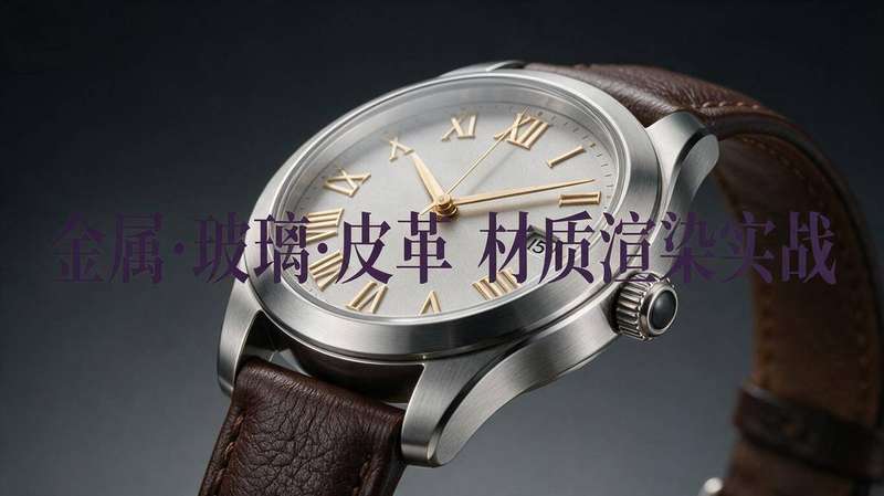
Last month, our team took on a luxury watch product animation project. The client demanded the cold metallic gleam of the dial, the crystal-clear depth of sapphire glass, and the warm, supple feel of crocodile leather. The first render test came back—metal looked like plastic, glass looked like water, and leather looked like sandpaper. I stared at the screen for three seconds, silently deleted the “first draft for review” message, and replaced it with “internal review, will submit tomorrow.” After a week of intense debugging, research, and reference deconstruction, we finally understood the true nature of these three materials. Today, I’m sharing the hard-won lessons so you can avoid the same mistakes.
1. Metal: The Battle Between Roughness and Gloss
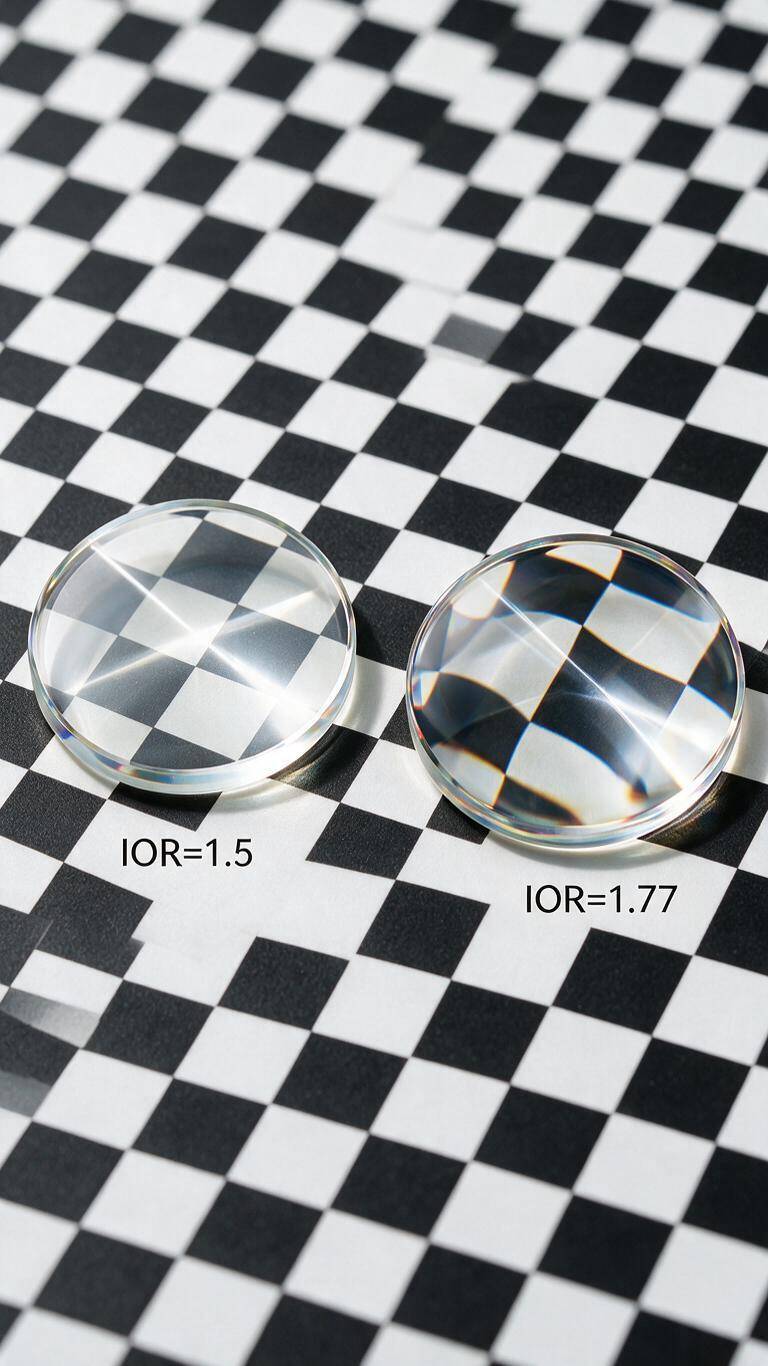
The key parameters for metal are simple: Roughness and Metallic. But in practice, 90% of problems come from roughness.
Pitfall 1: High Roughness Leads to a Plastic Look
We initially set Roughness=0.4 to simulate a brushed finish, but under HDRI the metal lost all specular highlights and looked like gray plastic. The truth is real metal roughness is between 0.05 and 0.3. Brush effects should be simulated with Anisotropic roughness, not by increasing overall roughness.
Solution: Switch to anisotropy (roughness 0.1) + an anisotropic direction map. This instantly revived the brushed metal feel.
Pitfall 2: Missing Environment Reflections Causes Dead Black
Metals rely entirely on environment reflections for brightness and color. Using a plain white soft background made the watch dial look dim and lifeless.
Solution: Always use at least one high-quality HDRI (e.g., garage or studio HDR). Add a Fresnel effect to enhance edge reflections for extra depth.
2. Glass: The Art of Balancing IOR and Transparency
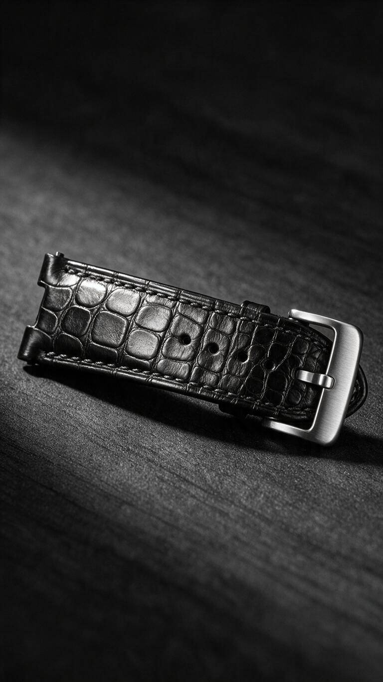
Sapphire crystal glass on the watch was the trickiest part. Its IOR is high (~1.77) and it needs to show both clear internal structures and sharp reflections.
Pitfall 1: Non-Watertight Geometry Causes Refraction Chaos
Our first render showed strange lines and black holes inside the glass. It turned out the model was a single surface, not a solid. Subsurface scattering and refraction algorithms require watertight geometry.
Solution: Convert the glass model to a solid (add thickness) and ensure normals face outward. Enable two-sided rendering and transmission channel.
Pitfall 2: Wrong IOR Causes Distorted Refraction
Using IOR=1.5 (standard glass) made the hands appear unmagnified and light paths looked wrong. Switching to IOR=1.77 (sapphire) immediately fixed the distortion.
Pro Tip: For multi-layer glass (e.g., glass + air + dial), assign separate IORs to each layer and use absorption coefficient to simulate slight color (e.g., a faint blue tint for sapphire).
3. Leather: The Details of Texture and Bump Maps
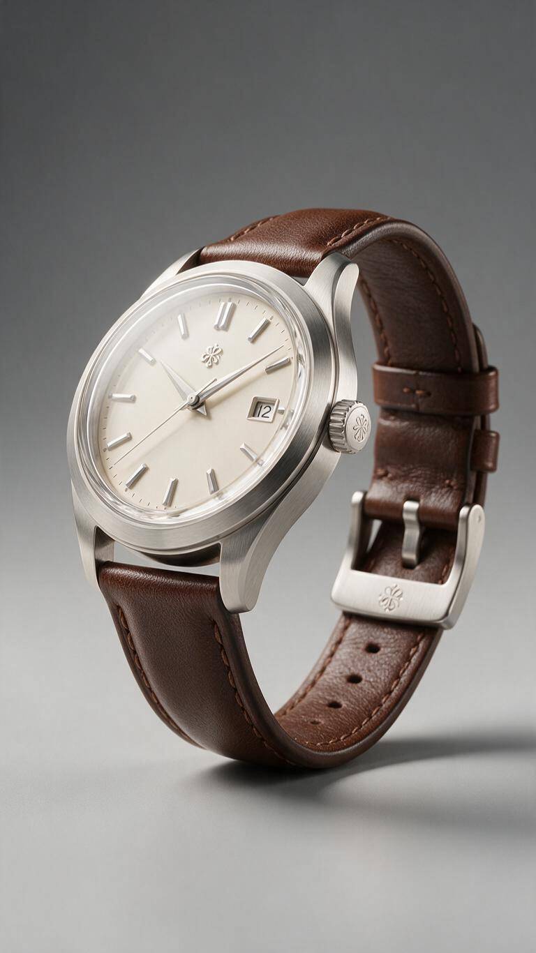
Crocodile leather required clear but not exaggerated texture, plus a warm, tactile visual feel.
Pitfall 1: Tiled Texture Repetition Looks Cheap
A plain UV-tiled crocodile pattern created a grid-like artificial look. Real leather scales vary in size and orientation.
Solution: Use procedural noise (e.g., Perlin) to offset texture coordinates slightly. Use multiple UV sets: one for main texture, one for bump details to avoid interference.
Pitfall 2: High Bump Intensity Causes Flickering
Setting bump intensity to 5.0 made scales pop but introduced severe aliasing in animation.
Solution: Reduce bump intensity to 1.0–2.0 and combine with anisotropic roughness map to simulate directional wear. Strongly consider displacement mapping instead of bump—it’s slower but eliminates flickering and gives real geometric detail.
Summary: No Silver Bullet, but Build Your Own Recipe Library
After this project, we created an internal material parameter library recording the optimal ranges and common fixes for metal, glass, leather, and more. Now, before each new project, we load the preset and fine-tune based on actual lighting and product form—boosting efficiency by at least 50%.
Three quick takeaway rhymes (unofficial):
- Metal: Low roughness + environment reflections + anisotropy
- Glass: Watertight geometry + accurate IOR + absorption
- Leather: Random texture + low bump + directional wear
Hope these tips save you from the same struggles. If you have your own tuning secrets, drop them in the comments!