
What You Don't Know: Color Can Eat 30% of Your Conversion
Let's start with a real data point.
At the end of 2025, we ran a small experiment for a Bluetooth headphone brand. The AI+3D product animation video for the same product — identical content, pacing, and length — had only one variable: the background color scheme:
- Version A: Solid black background (common approach)
- Version B: Deep blue + teal gradient background
- Version C: Warm gray + gold halo background
The result? Version B achieved a click-through rate (CTR) 47% higher than Version A on Amazon, and 22% higher than Version C. Identical video content — the only variable was color.
A 47% gap. This isn't something you can achieve by spending more on a better render engine — it's purely the power of color choice.
That's why I say: color is severely underestimated in product animation.
Why Does Color Matter So Much in Product Animation?
1. Color Determines First Impressions — In 0.05 Seconds
A Google eye-tracking study revealed a brutal truth: when users browse e-commerce search results, it takes only 50 milliseconds to form a first impression. In that time, the user hasn't even processed what the product is, but color has already subconsciously completed the "beautiful/ugly" judgment.
In 3D product animation, color's impact is even more layered:
- Background color: Determines the overall vibe of the video — "premium" or "cheap"
- Product material color: Color reproduction of metal, glass, and plastic directly affects perceived quality
- Lighting color: Highlight color temperature and shadow warmth form an implicit color narrative
- Text/UI color: Subtitle, feature label, and price tag colors guide the viewer's eye
These four layers of color information stack in the viewer's brain within 50 milliseconds, instantly forming a judgment of "how much is this worth."
2. Color = 60% of Brand Memory
A consumer's first memory of a brand isn't the logo shape or the slogan — it's color. This is a well-established fact supported by extensive psychological research.
Think about it: when you think of Coca-Cola, what's the first thing that comes to mind? Red. What about Tiffany? That iconic robin's egg blue. That's the power of brand color.
In e-commerce product animation, color consistency is crucial for brand building. In our visual transformation case from Shenzhen to Los Angeles, one of the core tasks was establishing a unified brand color system.
Four Core Principles for E-Commerce Product Animation Color
Principle 1: Category Mood Board — Different Products Have Different "Color Personas"
Not every color works for every product. This is the most fundamental yet most overlooked rule.
Based on our experience serving 200+ cross-border e-commerce clients, we've summarized the "optimal color tones" for different product categories:
| Category | Recommended Main Color | Recommended Ambient Color | Psychological Association |
|---|---|---|---|
| 3C Electronics | Deep Blue / Black | Teal, Silver Gray | Tech-forward, Precision, Professional |
| Beauty / Skincare | Pink / White / Gold | Rose Gold, Cream White | Elegant, Pure, Premium |
| Home / Furniture | Warm Wood / Off-White | Warm Gray, Natural Light | Comfortable, Natural, Quality |
| Sports / Outdoors | Orange / Black / Olive | High-Contrast Warm Light | Energetic, Rugged, Dynamic |
| Food / Beverage | Warm Yellow / Red / Green | High-Saturation Warm Light | Appetite, Freshness, Energy |
This isn't theoretical — it's practical wisdom distilled from extensive A/B testing. For example, the deep blue + teal combination for 3C products was first validated in our AI+3D Product Animation for 3C Electronics case study — users said it "looks more expensive."
Principle 2: Platform Adaptation — Amazon and TikTok Have Completely Different Color Needs
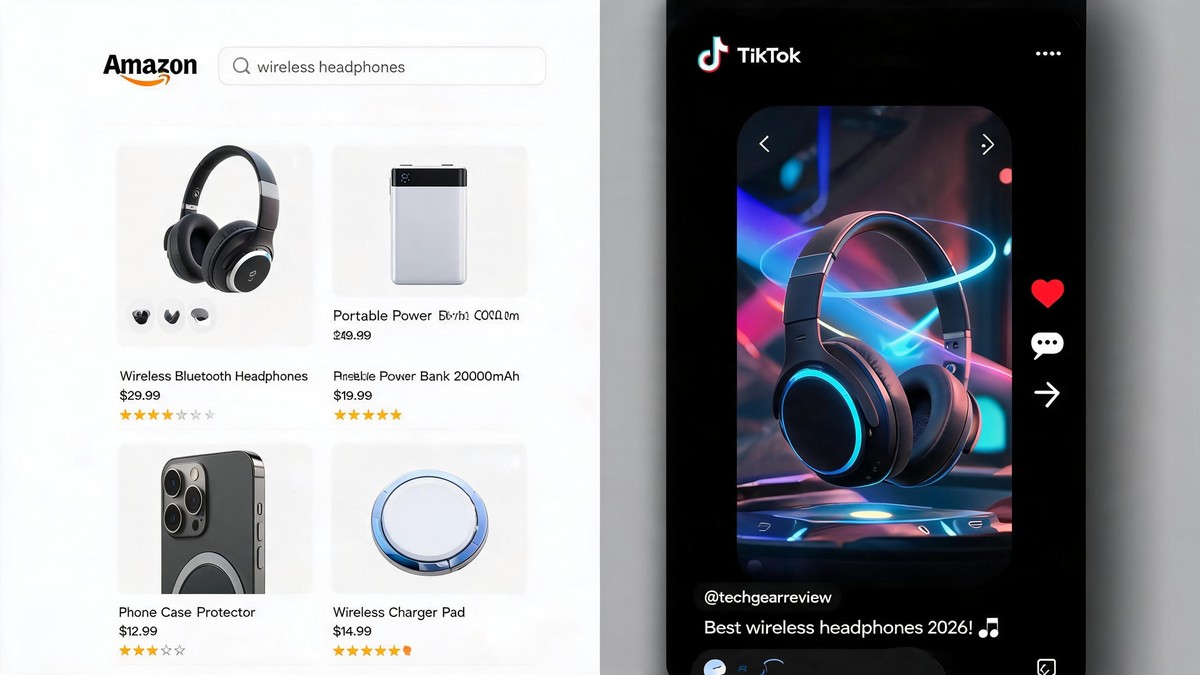
The same product animation needs different color strategies for different platforms, because each platform has its own background environment and user psychology:
- Amazon Search: White background, users in "comparison shopping" mode — needs high clarity and differentiation. Cool tones (blue/gray/black) stand out better against white.
- TikTok / Short Video: Dark mode dominates, fast-scrolling feed — needs high contrast + warm tones to grab attention. Warm oranges and pinks pop best on dark feeds.
- DTC Brand Hero: Large screen display, active browsing — can use gradients + depth for immersion, colors can be more "artistic."
- Instagram: Square/vertical format, higher aesthetic expectations — complementary color pairings (cool + warm) get the most engagement.
This finding was especially notable when working with a smart home brand — the same master animation performed differently everywhere: on Amazon, the white-background cool-tone version had higher CTR; on TikTok, the warm gray + contextual background version got more views.
Principle 3: Material Color Accuracy — Making "Quality" Visible
In 3D product animation, color isn't just about backgrounds and UI. The material color accuracy of the product itself directly impacts the consumer's perception of quality.
This involves color management within PBR (Physically Based Rendering) material systems in 3D:
- Metallic colors: Not just simple gray. Brushed metal has directional highlight variations requiring precise tuning of Roughness + Metallic + Anisotropy
- Glass / Transparent colors: Thickness determines color intensity — thicker parts lean greener/bluer. Use Volume Absorption to simulate
- Plastic / Matte colors: Most prone to "looking gray." The fix is adding Subsurface Scattering (SSS) micro-adjustments in the material node
- Leather / Fabric colors: The key is micro-fuzz on the surface — achieved through Normal Map + Roughness Map combination
Our article on product animation lighting techniques covers lighting in detail, but accurate material color reproduction is essentially a "light + material" chemical reaction — the same beam of light hitting metal vs. plastic produces completely different colors.
Pro tip: When rendering a product, place a reference sphere (pure white / mid-gray / pure black) in the scene. Comparing your product's color against the reference quickly reveals white balance shifts or color temperature issues. This is standard practice in professional 3D studios.
Principle 4: AI Auto-Coloring — Balancing Efficiency and Aesthetics
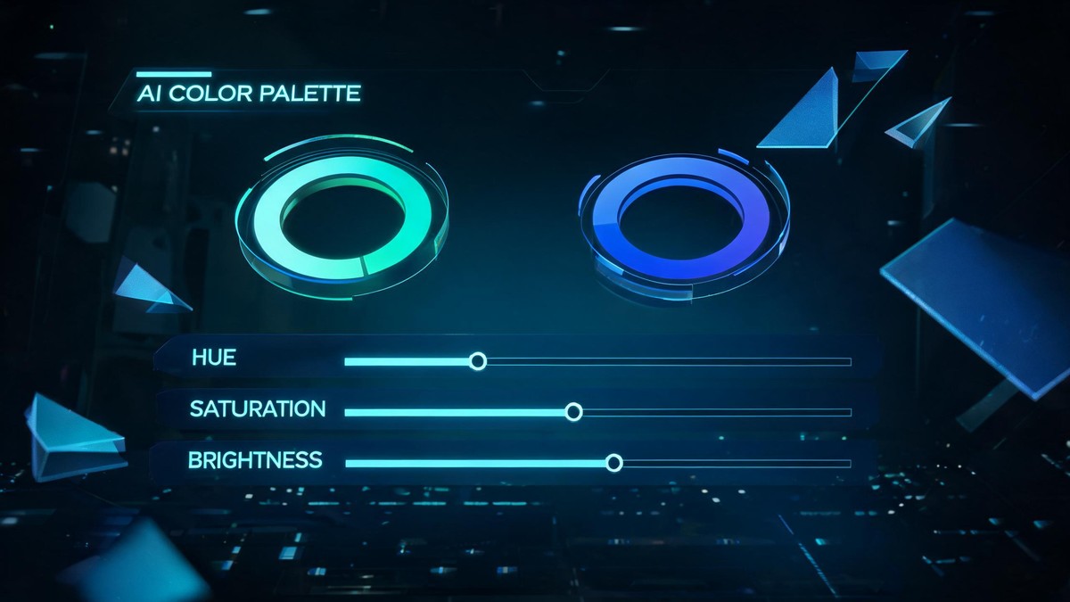
AI can already play a significant role in color selection. But it's not as simple as "AI generates the perfect palette with one click."
What AI can currently do:
- Brand color extraction: Automatically extract primary, secondary, and accent colors from brand logos and VI guidelines to build a custom brand palette
- Competitor color analysis: Capture competitor listing screenshots, analyze their dominant colors and saturation distribution, and identify your differentiation opportunity
- Platform auto-adaptation: Feed an Amazon video's color scheme to AI, and it can automatically calculate adapted versions for TikTok, Instagram, and DTC sites
- A/B test recommendations: Based on category data and historical CTR, AI can recommend alternative color schemes most likely to boost clicks
What AI still can't do:
- Precise "aesthetic judgment" — AI knows "which color gets higher CTR" but not "which color looks more beautiful"
- Brand emotional communication — how color evokes "luxury" vs. "approachability" still requires human aesthetic input
- Cultural adaptation — the same color means completely different things in different countries (e.g., white = mourning in China, purity in the West)
So in our workflow, AI handles color screening and recommendations, while the final palette is always determined by human designers. This is the optimal combination of "AI efficiency + human aesthetic judgment."
Real Case: One Color Adjustment Delivered a 68% CTR Boost
Let's look at a concrete example.
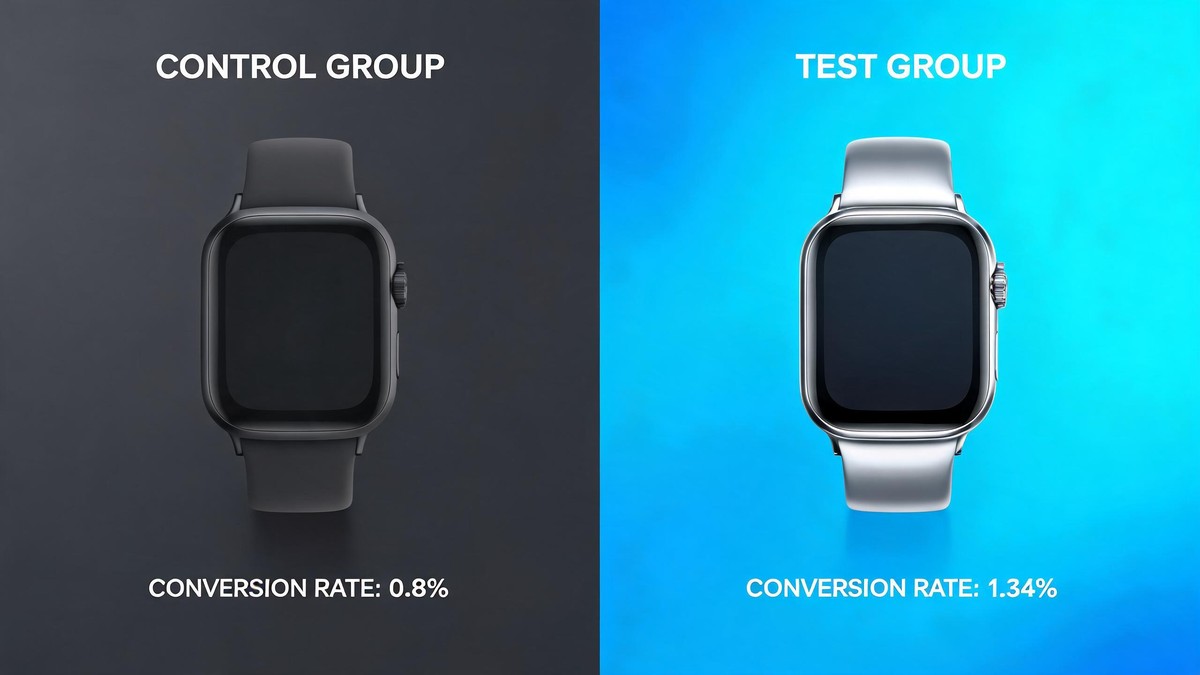
In early 2026, a cross-border brand specializing in smart wearables approached us. Their flagship product — a sports smartwatch — was underperforming on Amazon. The product itself was solid with comprehensive features, but the main image video's CTR hovered at just 0.8%, well below the category average of 1.5%.
After reviewing their product animation video, we identified a critical visual issue:
The product itself was dark gray (brushed metal dial + black silicone strap), and the background was pure black. 80% of the video's frames existed in a "black → gray → black" range, with zero color tension.
Our adjustment — changing only three color elements:
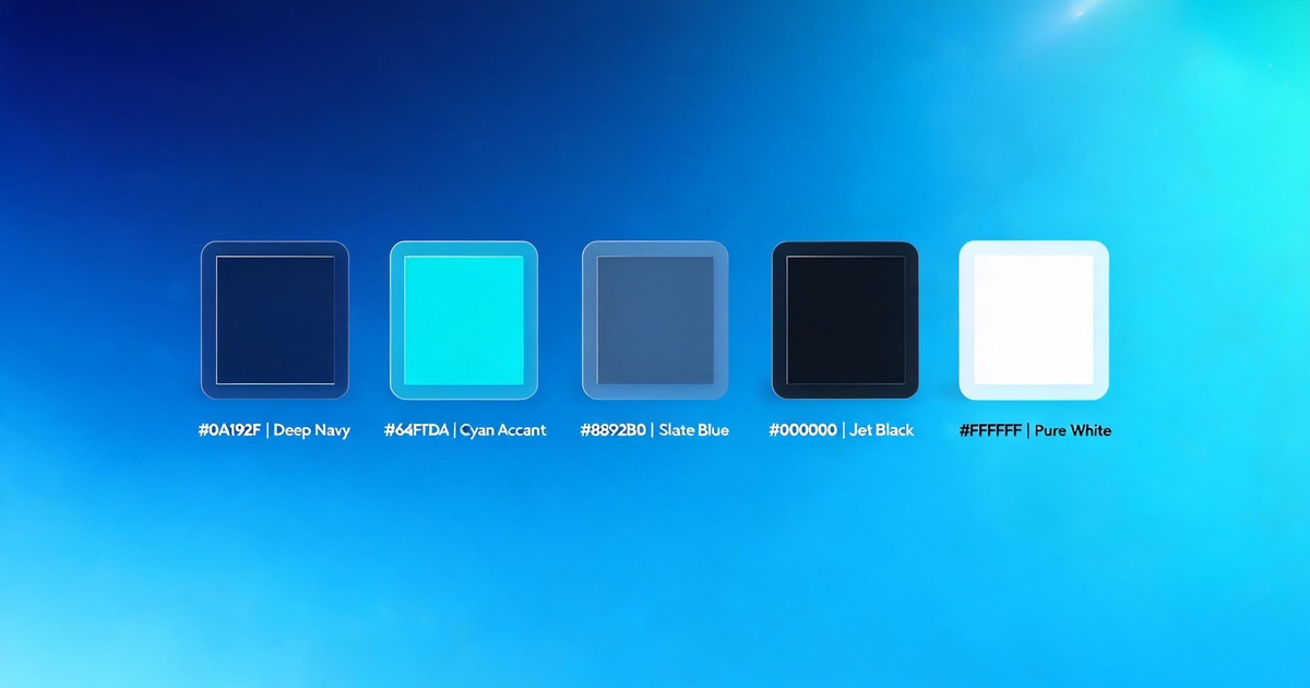
- Background: From pure black to deep blue (#0a1628) + teal gradient (#064e3b), matching the "energetic + tech" category tone
- Highlight color temperature: From pure cool white (6500K) to slightly warm golden light (4200K), giving the metal dial bezel more textured highlights
- Feature label color: Data visualization elements (heart rate, steps, etc.) changed from white to teal (#10b981), creating a "blue → green" color thread with the background
Results:
- 7 days after the new version launched, main image video CTR rose from 0.8% to 1.34% (+68%)
- A+ page video completion rate jumped from 42% to 71%
- More unexpectedly: in Amazon search results, all surrounding competitors had black, white, or gray backgrounds — only our deep blue background popped in thumbnail view
The brand told us later: the cost of this color adjustment was less than 5% of the production fee, but the conversion boost was equivalent to increasing their listing's ad budget by 70%.
5 Color Self-Checks You Can Do Right Now
Pull up your current product animation video and ask yourself:
- Was the background color "just picked"? — If it's black just because you didn't know what else to use, there's likely an issue
- Does the color palette match your category's tone? — The cool tech tones that work for 3C will look cheap on beauty products
- Did you color-grade each platform version separately? — An Amazon video dumped straight onto TikTok will almost certainly look off
- Is the product's material color accurate? — Take a video screenshot and compare it to the real product. Is the color shifting warm or cool?
- What colors do your competitors use? Can you find a differentiator? — Scroll the search results page. Does your thumbnail stand out among 30 competitors?
Conclusion: Color Is a Severely Underestimated Conversion Lever
In product animation, most people obsess over "how cool the animation looks." But the truth is: color has a bigger impact than animation complexity.
A simple product rotation animation + a well-designed color palette often outperforms a complex effects animation + random colors in both CTR and conversion.
Why? Because animation complexity affects the "viewing experience," but color affects "split-second decisions" — in that 48x48 pixel thumbnail on the search results page, can your color tell the user "stop and look" within 0.05 seconds? That's the first principle of e-commerce visuals.
ARTSKY Studio
Specializing in AI+3D Product Animation Video
Not just making products move — making their colors speak