You just received an AI+3D product animation rendered fresh from the farm. The lighting is beautiful, the transitions are slick, and you immediately think, “Ship it!”
But the next day your boss asks: “Is the logo on the cap misaligned?” “Why does the fabric look like plastic?” “When should we pay the final invoice?” You suddenly realize you have no idea what to actually check.
We all know how to buy physical products, but reviewing animation often comes down to “feeling”. So here's a practical guide: the 5 key checkpoints before you accept an AI+3D product animation, and exactly how to verify each one.
1. Model Accuracy: First Impressions Determine the Passing Grade
Model accuracy means whether the product in the animation really looks like the physical object – not just “kind of”, but “could pass as a sibling”.
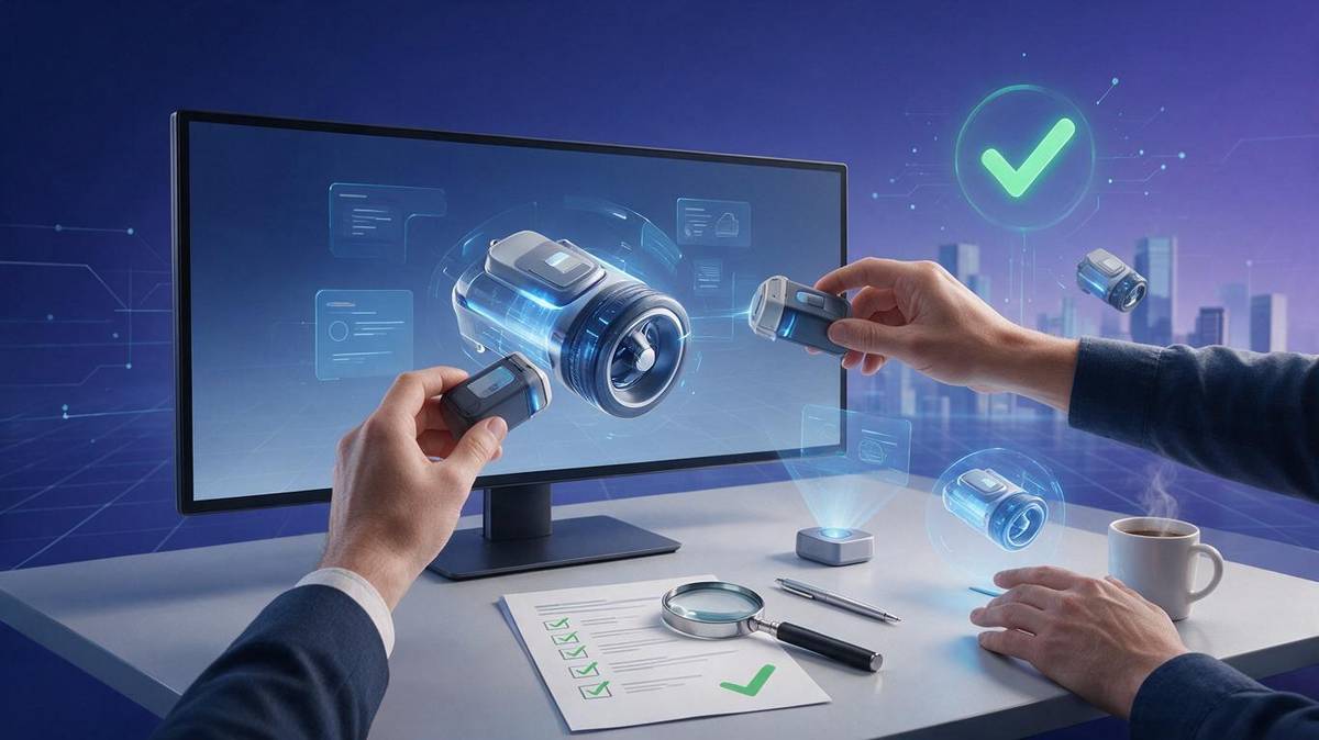
How to check: Don't watch the moving video. Pause, then place the rendered frame next to a real product shot on the same screen. Focus on three areas:
- Outer silhouette: Use a reference line to compare the length-to-width ratio. Chamfers on digital devices, sealing edges on food packaging, gaps on machinery – everything must align.
- Fine details: Buttons, ports, logos, threads, buckles – anything users will stare at. Zoom to 200% to see if it's deformed.
- Texture mapping: Is the front label tilted? Is the side pattern upside down? Printed products are the easiest to mess up in UV mapping.
Key phrase: “Pause, compare, zoom.” It might seem tedious, but if you can't see a difference, try another frame.
2. Material & Lighting: Turn “High-End Vibe” into Measurable Elements
Many clients say “the texture feels off” without being able to explain why. But materials and lighting actually have checkable standards.
How to check: Find a slow-moving shot or freeze a single frame, then observe:
- Metal: Are the reflections sharp? Is the brushed metal grain direction consistent? Note: metal reading is about the shape of the environment reflection, not the texture itself.
- Glass/transparency: Are the edge refractions natural? Does the background behind the bottle look correctly distorted? If it looks like “fake ice”, the refraction data is wrong.
- Fabric/leather: Is the highlight distribution even? Is there subtle texture variation? Plastic-looking leather usually means the roughness map is missing.
- Lighting consistency: Across all shots, is the main light direction, shadow direction, and ambient color consistent? If one shot lights from the left and the next from the right, it's a dealbreaker.
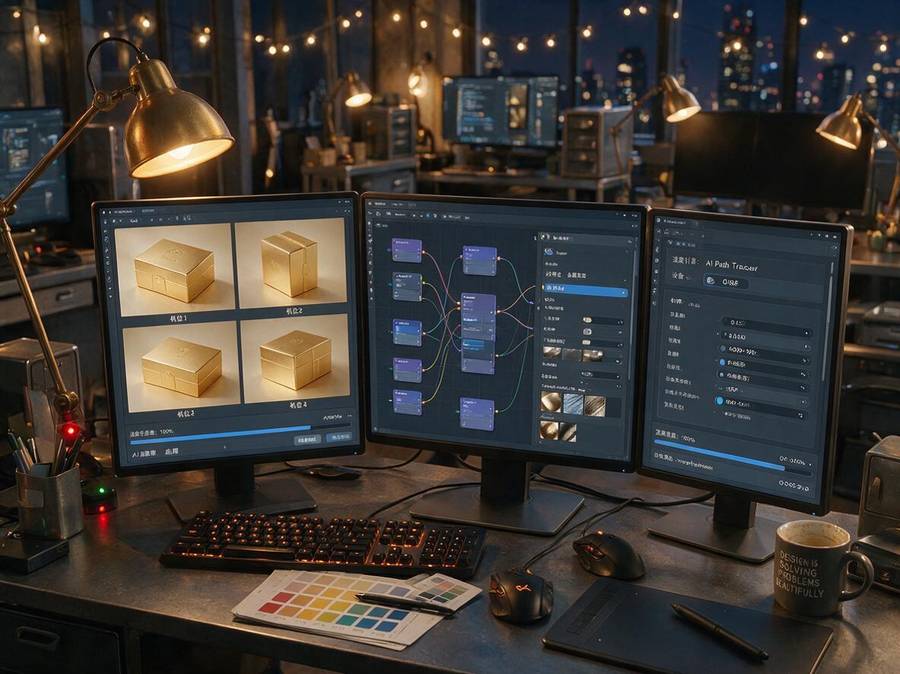
The simplest method: put the physical product next to your monitor, use one desk lamp as the main light, and compare angles. Your eyes are more accurate than any software.
3. Motion Fluidity: Step Through Frames, Don't Just Say “Smooth”
Common product animation actions: rotation, floating, explosion, assembly. They look simple, but if the keyframe curves aren't tuned, you get stuttering or “tail whip”.
How to check: Use frame-by-frame stepping, or slow the playback to 30%. Focus on the start and end of each motion – if there's no ease-out, objects stop like they hit a wall.
A rough standard:
- Rotation: within a 30° field of view, the movement between frames must be uniform, no micro-stutter.
- Rhythm: How long to rotate one full circle? Each segment — release, lift, explosion — should feel comfortable to the eye. Usually one full turn should take 1.5-2 seconds; too fast feels rushed, too slow feels dull.
- Motion blur: High-speed movement should have appropriate motion blur. If you see frame-by-frame “stop-motion” effect, it's likely not enough blur or low frame rate.
Key phrase: “Slow down, step through, watch the easing.” More useful than watching the whole film ten times.
4. Render Quality & Details: Fullscreen on Your Largest Display
Don't watch a small window in social media with beauty filters on. Go to your computer, use a 4K monitor, and go fullscreen.
How to check:
- Resolution: Confirm it's not SD. Even 1080p—check the bitrate, zoom in to see if there are blocks or color banding.
- Anti-aliasing: Look at diagonal edges and curves for “jaggies”. Especially logos and text edges should not look like sawtooth.
- Depth of field: Is the blur range natural? Is the focus correctly on the product? Too much DOF or wrong focus makes viewers uncomfortable.
- Camera movement: For a panning shot, does it move evenly? No jitter. Handheld feel is for documentaries, not product displays.
If your product animation is used as an e-commerce main image, the details should still be crisp when zoomed 2x on a phone.
5. Delivery Format & Reusability: Don't Just Get Back a “Video File”
The last pitfall is delivery format. Many clients receive an MP4 and celebrate, then a month later want to change background or color, only to discover they have to pay for a new project.
How to check:
- Source files: Confirm if an editable project file (e.g., Blender, C4D, Houdini) and its textures/assets are included.
- Transparent background: If you need to composite in post, ask for alpha-channel frames or MOV (ProRes 4444).
- Multiple sizes: E-commerce platforms have different needs (main image video, detail page, live streaming background). At minimum, cover 720p, 1080p, 4K, and vertical versions if necessary.
- Replaceable elements: Can colors, materials, and labels be changed easily? This depends on whether the source file is parameterized. If you just want a new color, the vendor should only need to adjust a node.
In one sentence: Ask yourself—if I hand this file to someone else, can they use it directly? If not, it's not delivered yet.
A Final Note
Acceptance is a process, not a feeling. Instead of giving a vague “looks good” score, go through these five points item by item.
At Artsky Film, all our AI+3D product animations follow a standard delivery specification. We provide a checklist with each project, clearly stating the standard for every point—from model accuracy to file formats. We're not afraid of clients being thorough; we welcome it. After all, you make products to sell them, and we make sure every frame is worthy of your product and your budget.